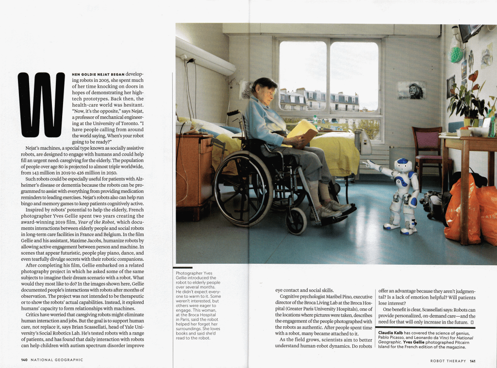
Below is the original Reebok ad that I’ve decided to analyze.
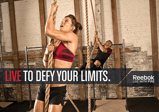
The design principles behind this ad campaign are fairly basic. First, there’s the use of repetition. In this image, we have the woman in the foreground climbing a rope, with a man in the background doing the same thing, underscoring the activity.

They also have a textual repetition that plays off of the “Live with fire” slogan that they’ve chosen for this ad campaign. The tag line here also starts with the word “Live” in red (differentiating it from the rest of the sentence in white) repeating the “Live” from the beginning of the slogan.

Beyond that, they use bright lighting but earth tones. This keeps the image easy to see but without running the risk of bright colors clashing. Earth tones are fairly un-challenging.
Graphically the use of the bar across the lower half provides an easy canvas on which to place the tagline, logo, and slogan. However rather than simply place a bar, they break it to off to the right, creating a long and a short “canvas.” This serves two good purposes.
First, it creates visual interest that a solid bar would not have given.
Second, it separates the tagline and the logo/slogan and allows them to be placed in their own areas but keeps them thematically connected by the use of the black bar behind them.
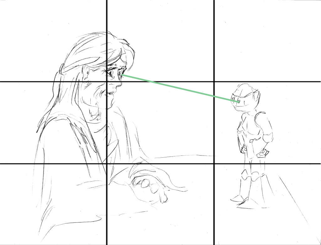
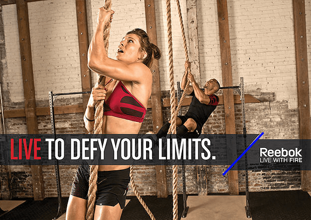
In attempting to create my own image to fit the ad campaign, this is what I came up with.
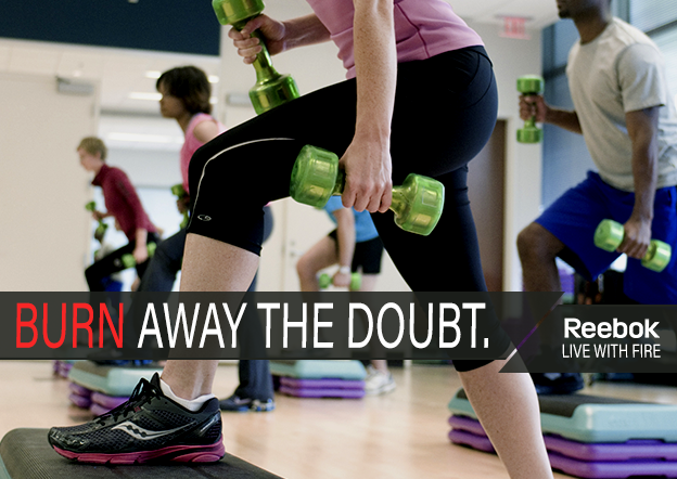
It was not easy to find an image that kept the earth tones of the one above, but not all ads in this campaign hold to that. What I was, however, able to do, was find an image that kept the repetition with several people in an aerobics class.

The graphic repetition of the broken bar is maintained, and the red/white font is also maintained. However while the first one repeats the word “Live” (and others in this same campaign use “Life” instead) my image takes the conceptual idea of the “Fire” of the slogan and starts the tagline with the word “Burn.”
Thematically the image fits into the ad campaign. The ads created for that campaign feature exercise and physical activities in groups and a unique slogan for each image. Graphically the broken bar is easy to recreate, and the color of the text remains consistent. The taglines recreate ideas from the slogan and create urges to both empowerment and action.