
Introduction
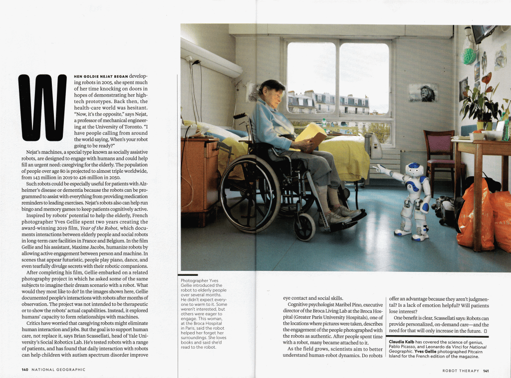
For my page layout analysis, I found a page in the latest issue of National Geographic. (nationalgeographic.com) The article “Take Me To Your Seniors” explore the use of robots as companions and therapeutic assistants to comfort seniors and supplement the escalating demand for caregivers. The article was written by Claudia Kaleb with photography by Yves Gellie, though I was unable to specifically identify the layout artist in charge of the page design.
Fonts
There are multiple typefaces visible here, highlighted in various colors in the image below. The main text (highlighted in yellow below) uses an Oldstyle font. You can tell from the slanted and bracketed serifs plus the slanted stress of the thick/thin transition. A font with serifs is a common and smart choice for large sections of text as the serifs create a horizontal line from letter to letter which helps lead the eye easily across the page.

The text in light purple, on the other hand is a sans serif text. Obviously there are no serifs in that kind of font but it’s also a rather monoweight font with no thick/thin transition. At least no transition visible to the eye at this font size. It has a more interesting silhouette on many of the letters but without serifs it’s better suited to shorter sections of text.
In green we get one last font. As there’s only one letter of that font visible, it becomes difficult to fully analyze what family it falls into, but looking at the previous pages we get a better idea. Clearly there appears to be no serifs, but with a much more highly stylized design we could easily place it in the decorative font family.
Image Analysis
As illustrated in the image below, the photo used in this layout uses the Rule of Thirds as the basic layout, placing the robot’s head near the intersection of two lines while the pictured senior’s head is placed near the intersection of the other two lines.
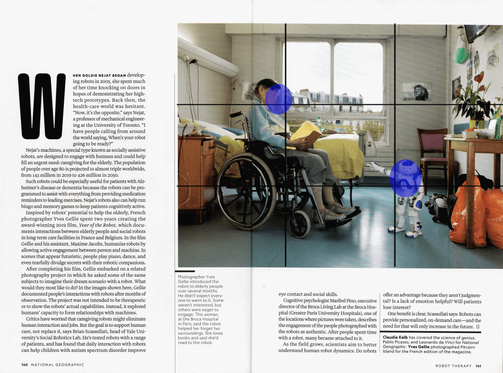
But it also creates an implied focal point with the arm of the robot. He’s pointing up at his photo-mate and creating an energy directed out through his arm.

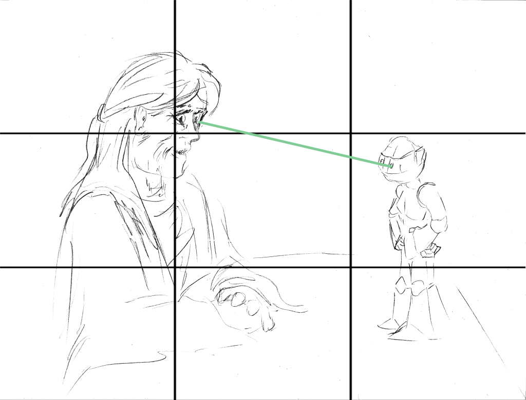
Alternate Images
I’m not exactly in a position to take alternate photos of my own to show different images that could have been used, not having a robot to model and not exactly having a camera to use. But I’ve sketched out three ideas to show how alternate ways the photographer could have framed it.
Example 1

For instance, in this first one, the elderly lady remains on the left third line and the robot remains by the right third line. The line created by the robot arm, however, is replaced by an implied line created by following the gazes of the two as they look at each other.
Example 2

This one moves the lady into the background, creating multiple depths. The robot is left on one of the one-third lines. The figure of the lady, however, now becomes a horizontal line directing the eye toward the robot in the foreground.

Example 3

This one moves the camera closer to the two figures. It’s a more intimately framed image but the lady remains on the left third line, the robot is still on the right third, and the arms of the robot continue to create the visual line directed toward the woman.

Summary
The article writes about using technology to help in a field that has, until now, been decidedly identified as a human issue. The photography and layout is used to emphasize the humanity of its subjects. And while there are concrete goals in the layout, just like in the article itself, there are often multiple ways to arrive at the end point.
